Wet Patience
Wet Patience is an ongoing creative project exploring clothing as a medium for countercultural messaging. Rooted in surf culture and informed by 70s rock and generations of women who trusted feeling over permission, the brand explores presence, rebellion, and embodied freedom through clothing.
Positioned between fashion, art, and cultural critique, Wet Patience functions as both a clothing line and a world-building exercise. Through language, form, and material, clothing becomes a carrier of values.
The Question
I grew up in a household ruled by logic, studied mechanical engineering, and later moved to the Bay Area to work in tech startups— contexts where value is closely tied to efficiency, output, and constant optimization.
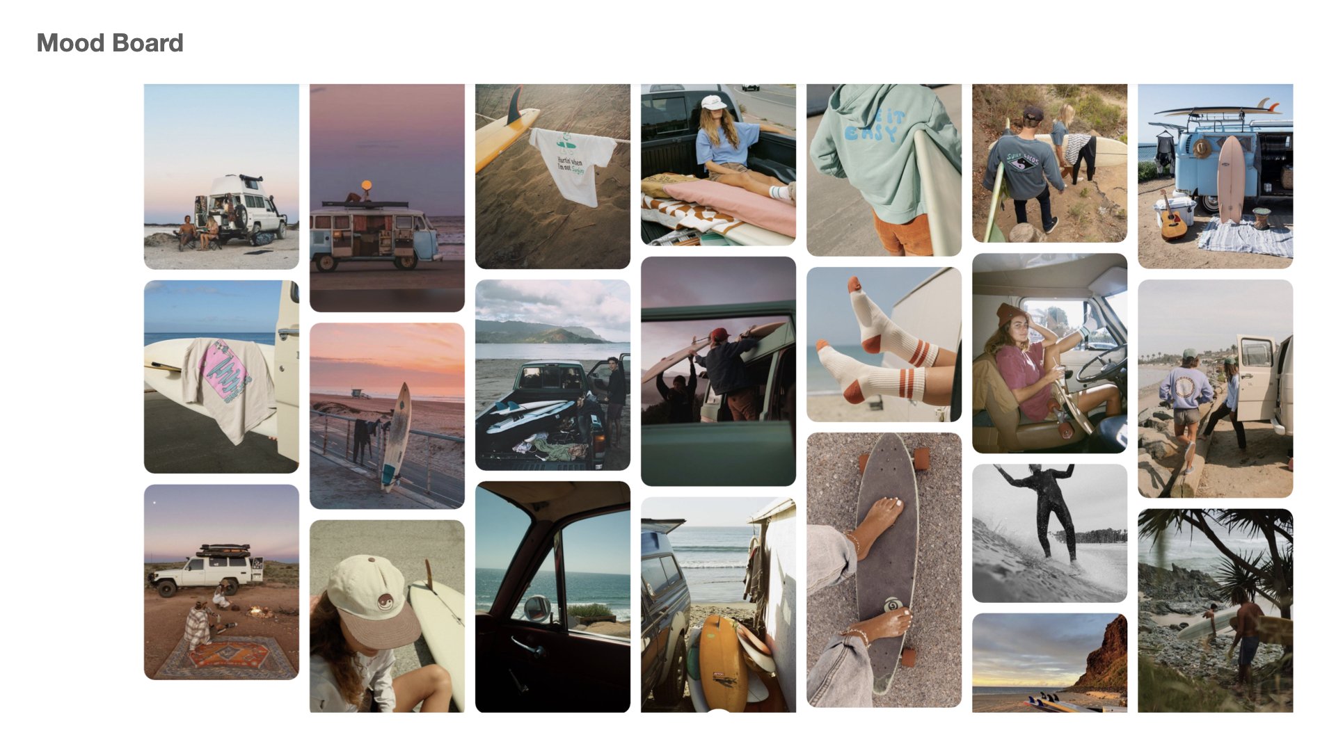
Spending time in Santa Cruz and learning to surf revealed a fundamentally different relationship to time and effort. Surfing requires patience, presence, and trust in timing. This contrast surfaced a question that became central to my work: what might it look like to move through the world guided by feeling and intuition rather than logic and control?
Through playful, provocative design, Wet Patience invites a different way of being.
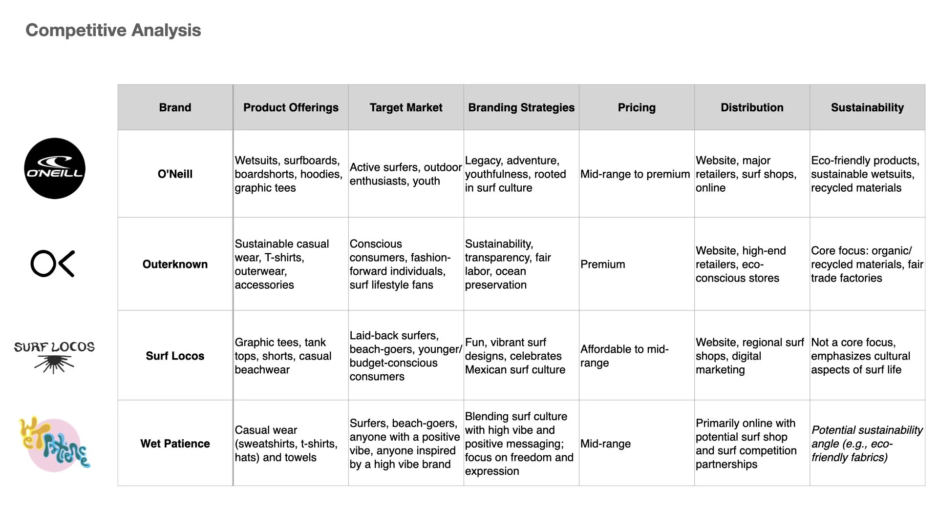
Wet Patience draws from two countercultural lineages:
Surf culture — patience, flow, surrender, presence
1970s rock culture — rebellion, emotional expression, refusal of polish
Together, these influences inform a brand language that embodies a soft rebellion
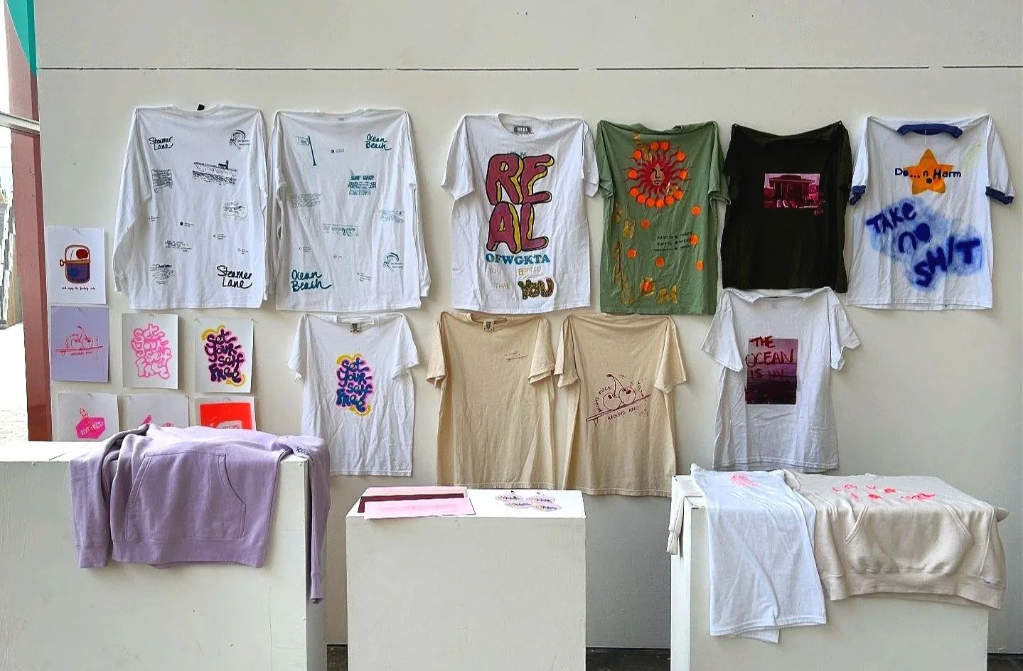
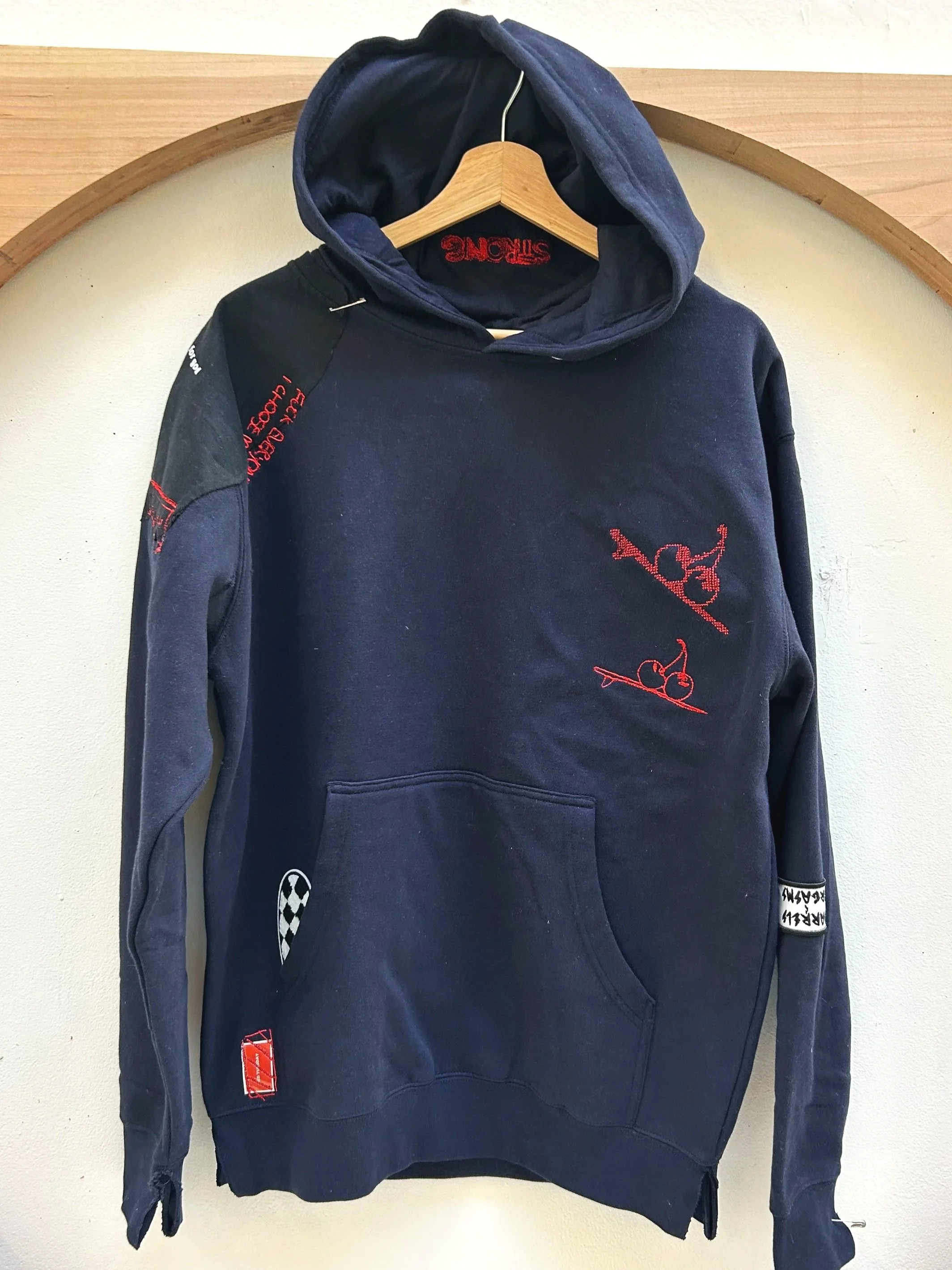
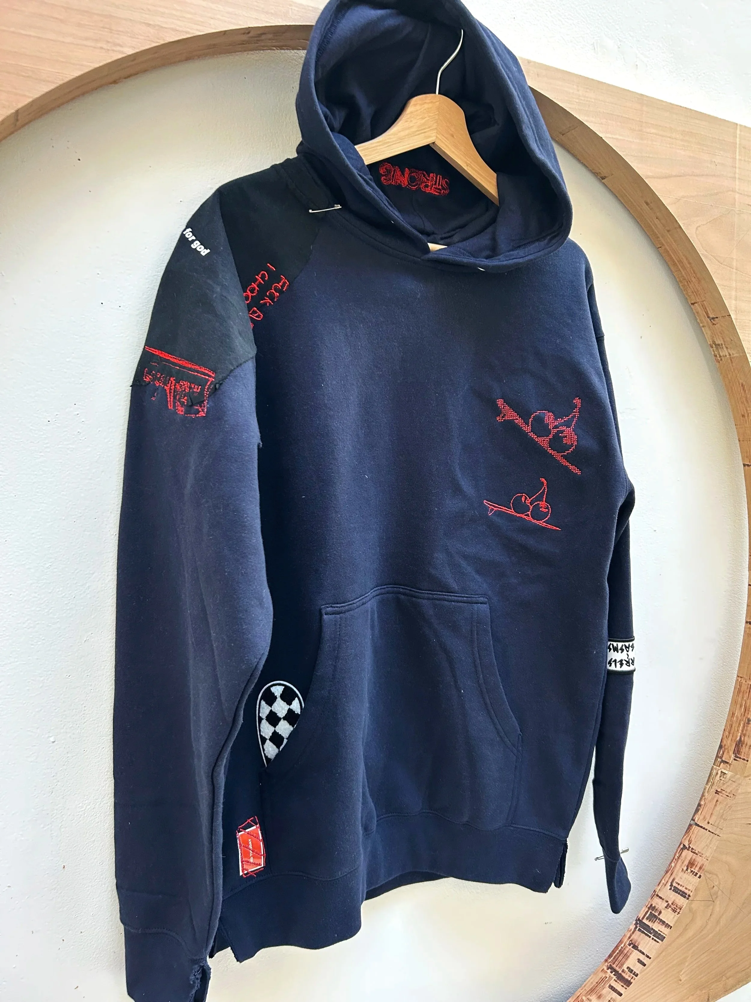
Apparel Prototypes & Drops
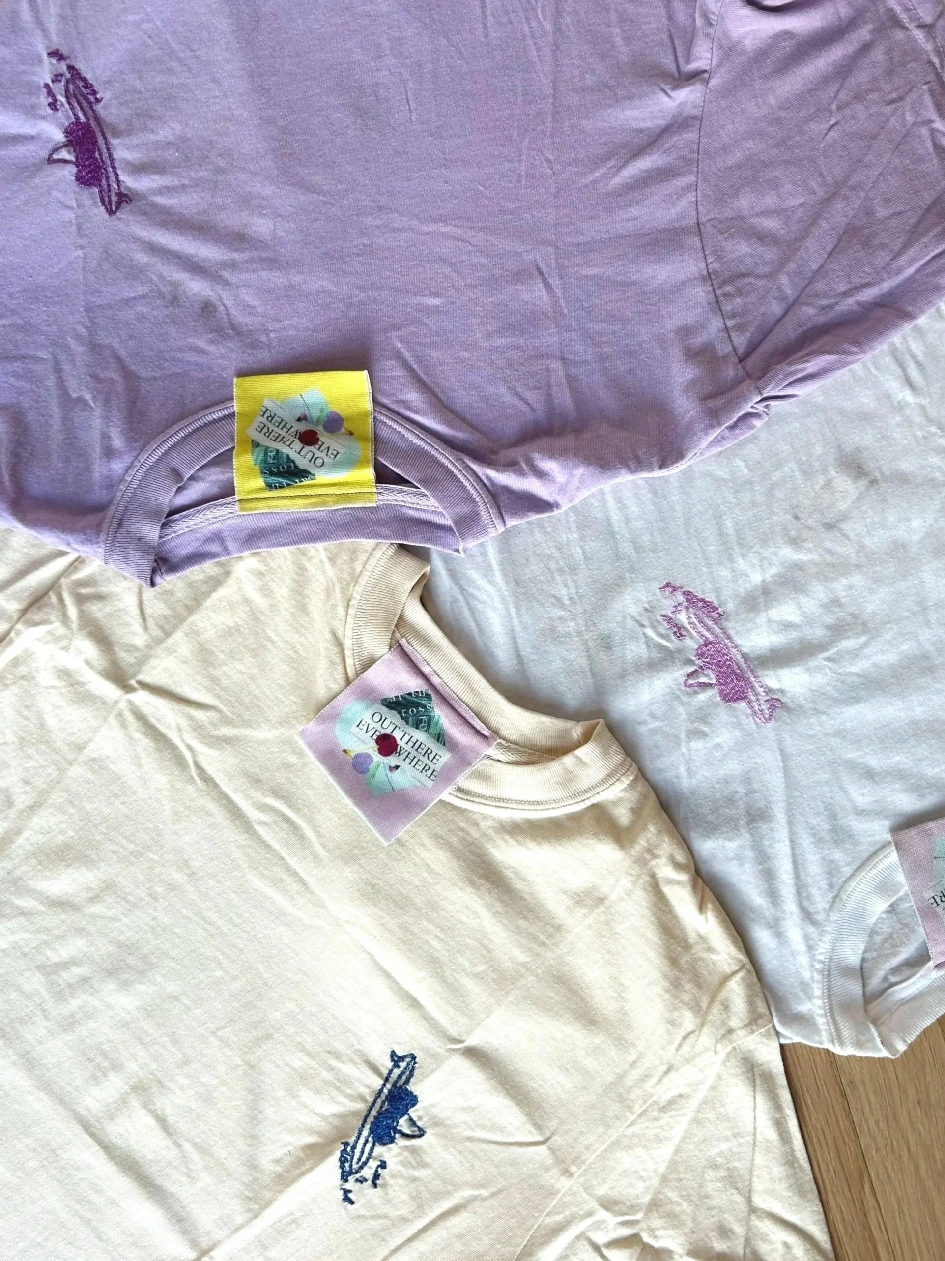
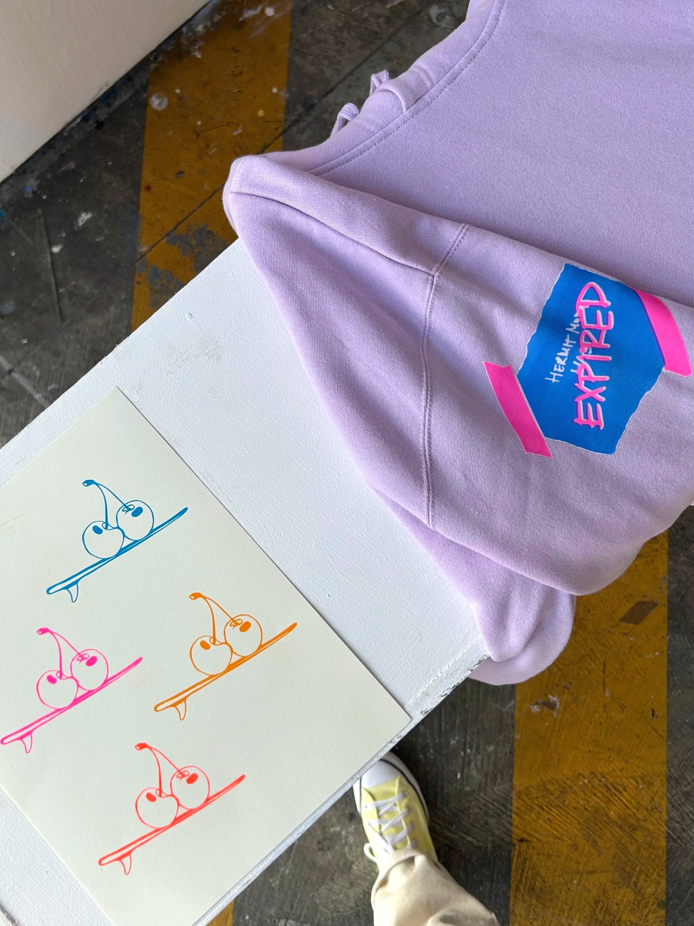
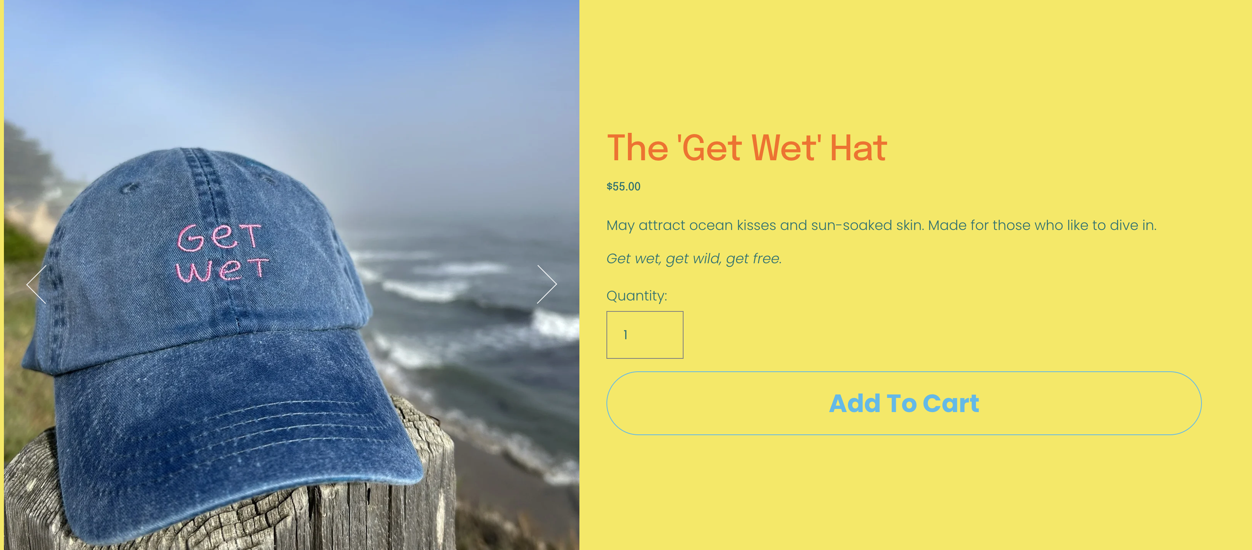
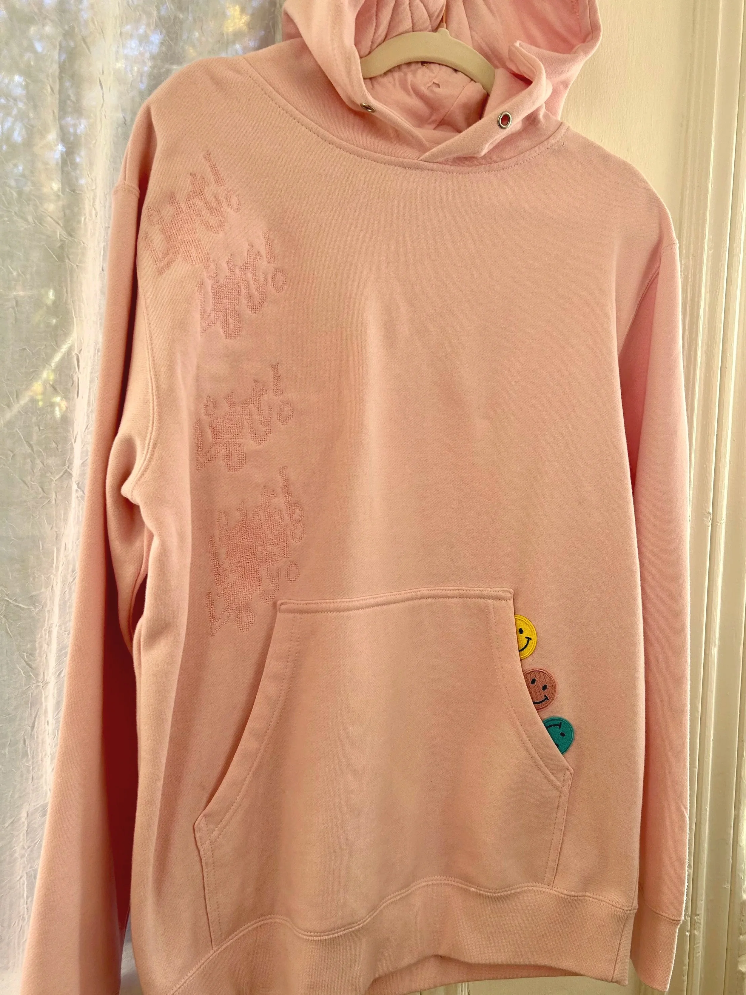
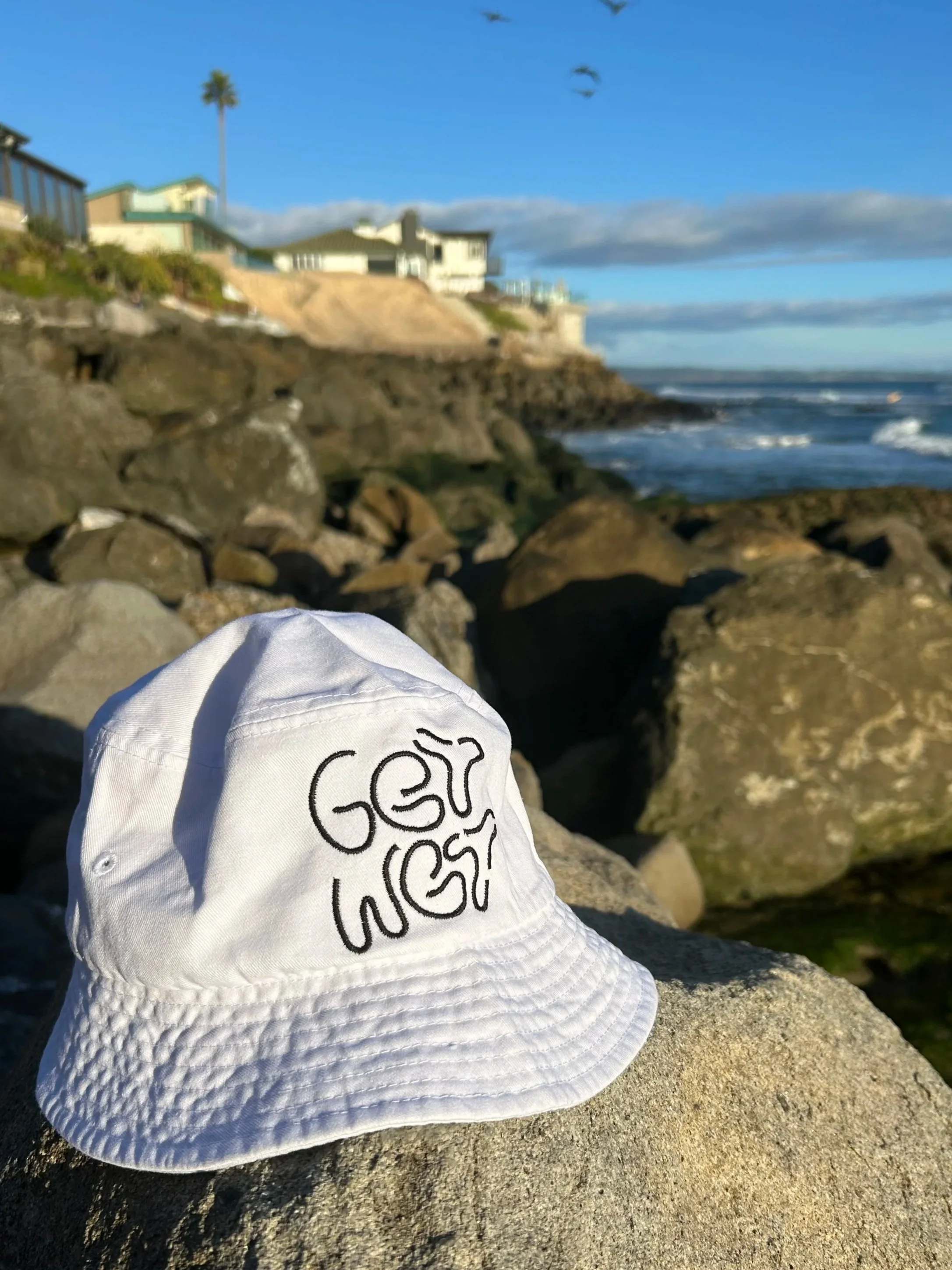
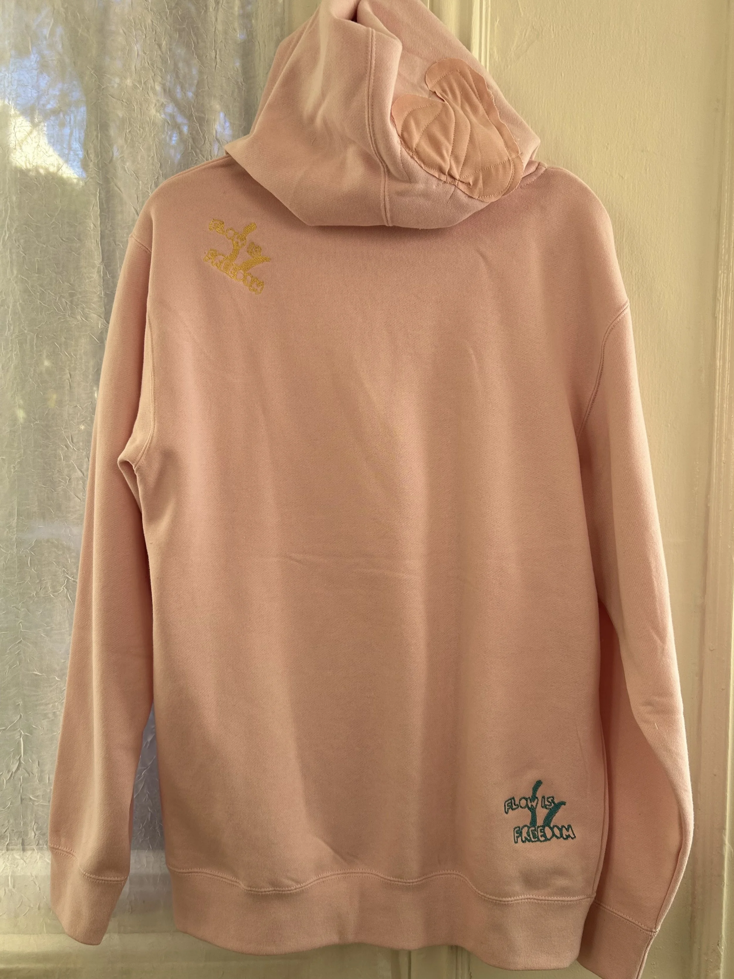
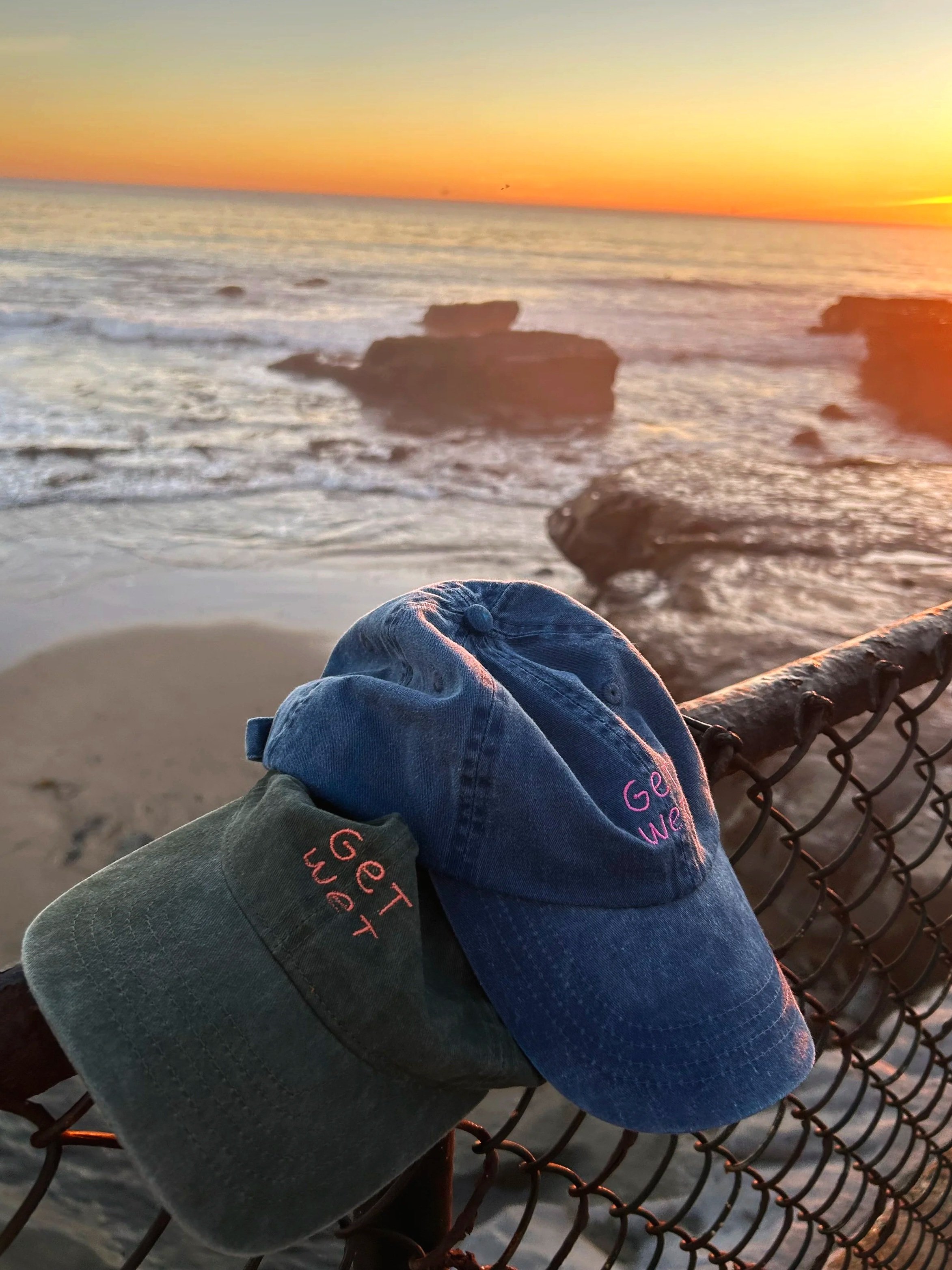
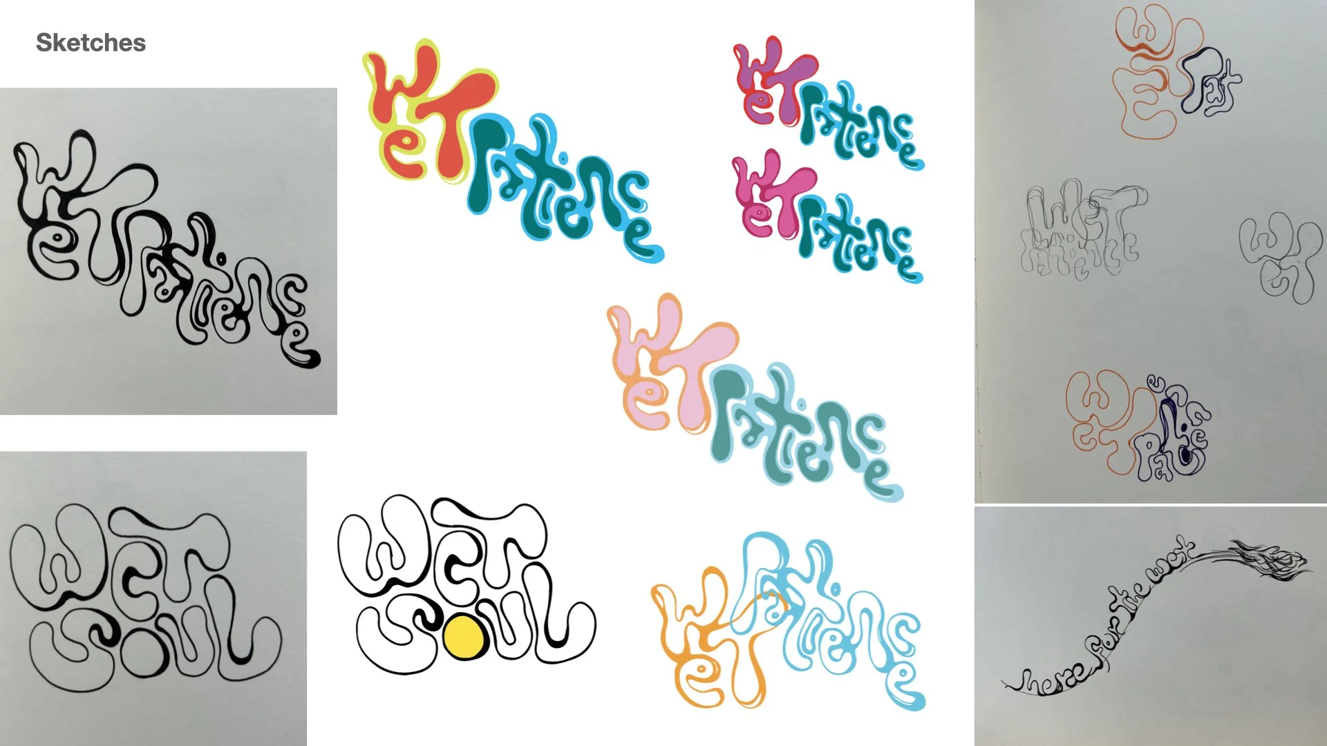
A series of apparel concepts exploring clothing as a medium for messaging and movement-building. I used several processes, such as hand-drawn typography, illustration, photography, and collage, to create imagery. I tested several production methods, including screen printing, embroidery, vinyl, and reworked thrifted garments, to understand how material, technique, and imperfection influence tone and emotional resonance. Each piece functions as both a wearable artifact and an attitude.
Editorial / Worldbuilding
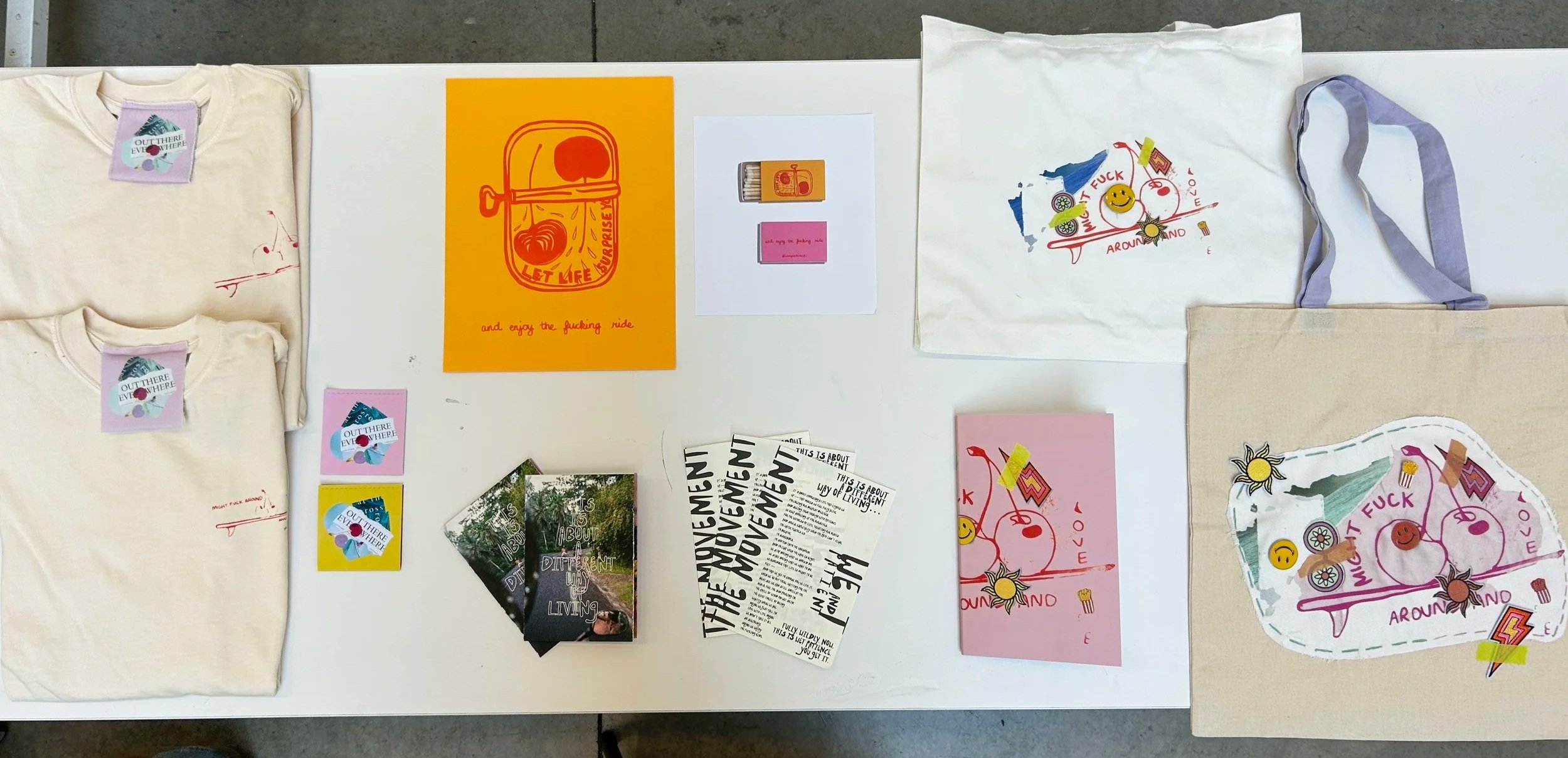
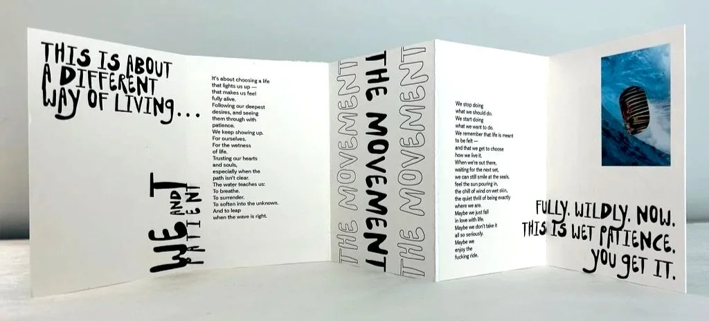
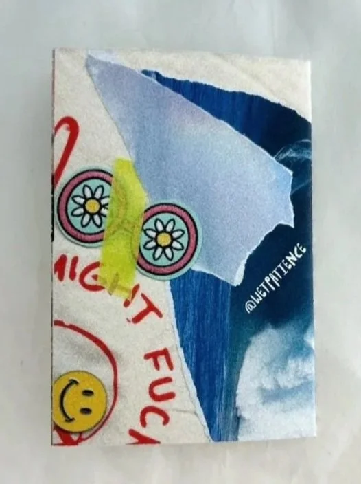
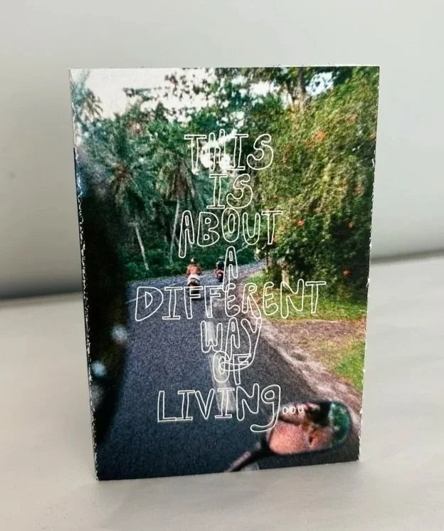
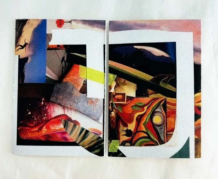
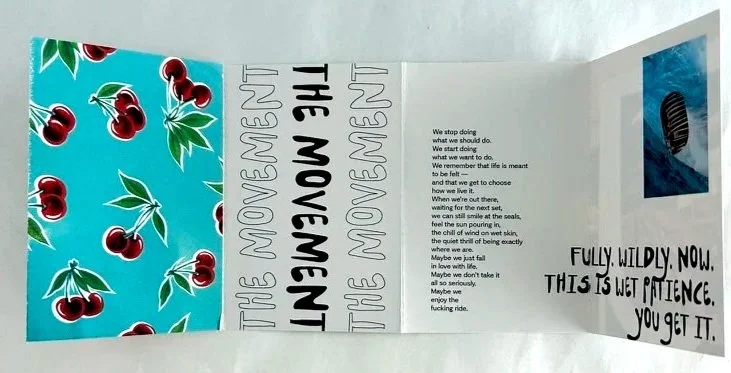
Five-fold printed manifesto combining hand-done collage, typography, and written text on thick matte paper. Designed to unfold gradually, expressing the Wet Patience way of living.
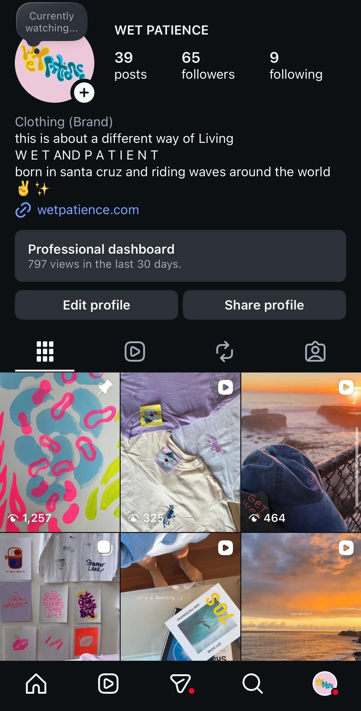
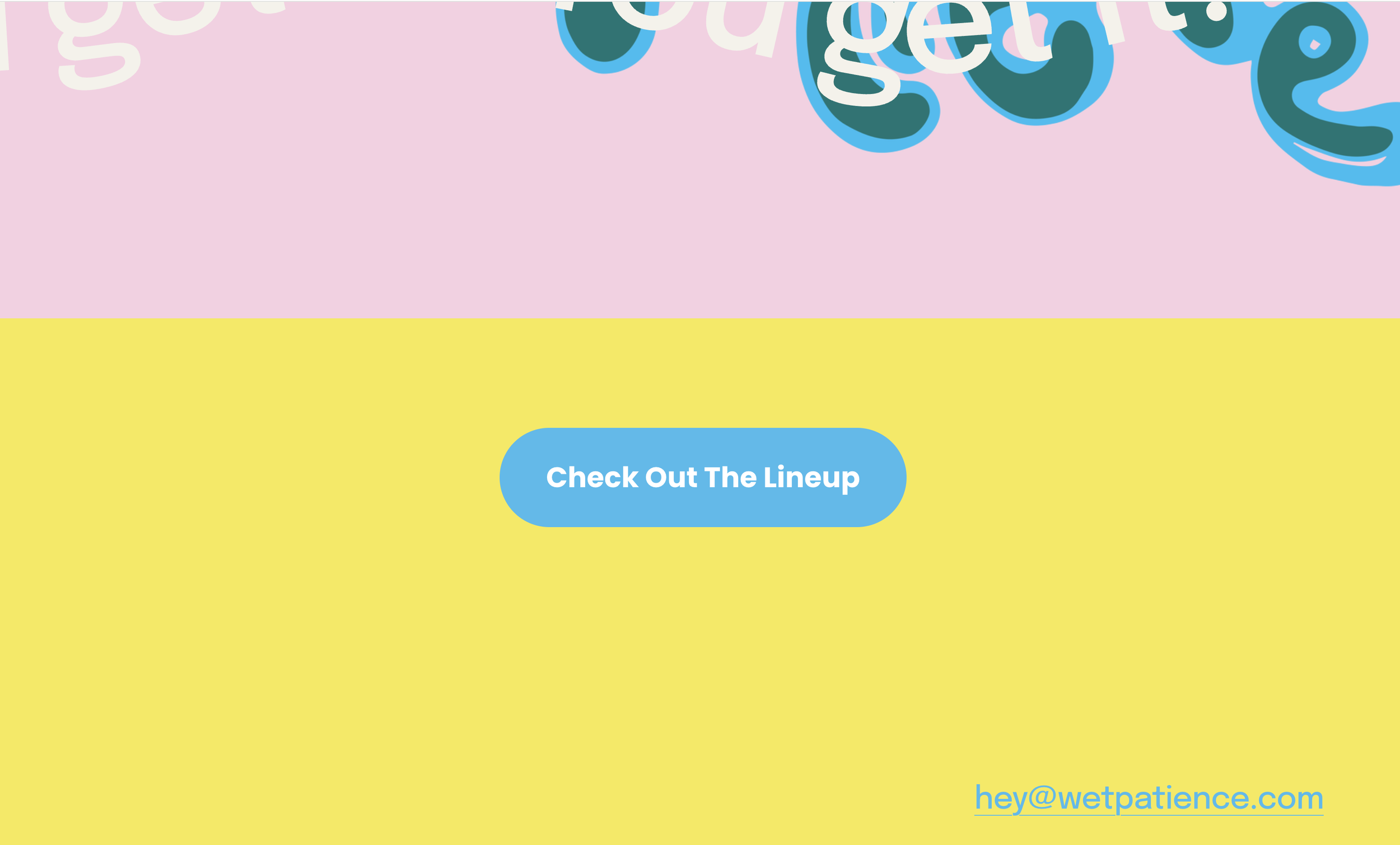
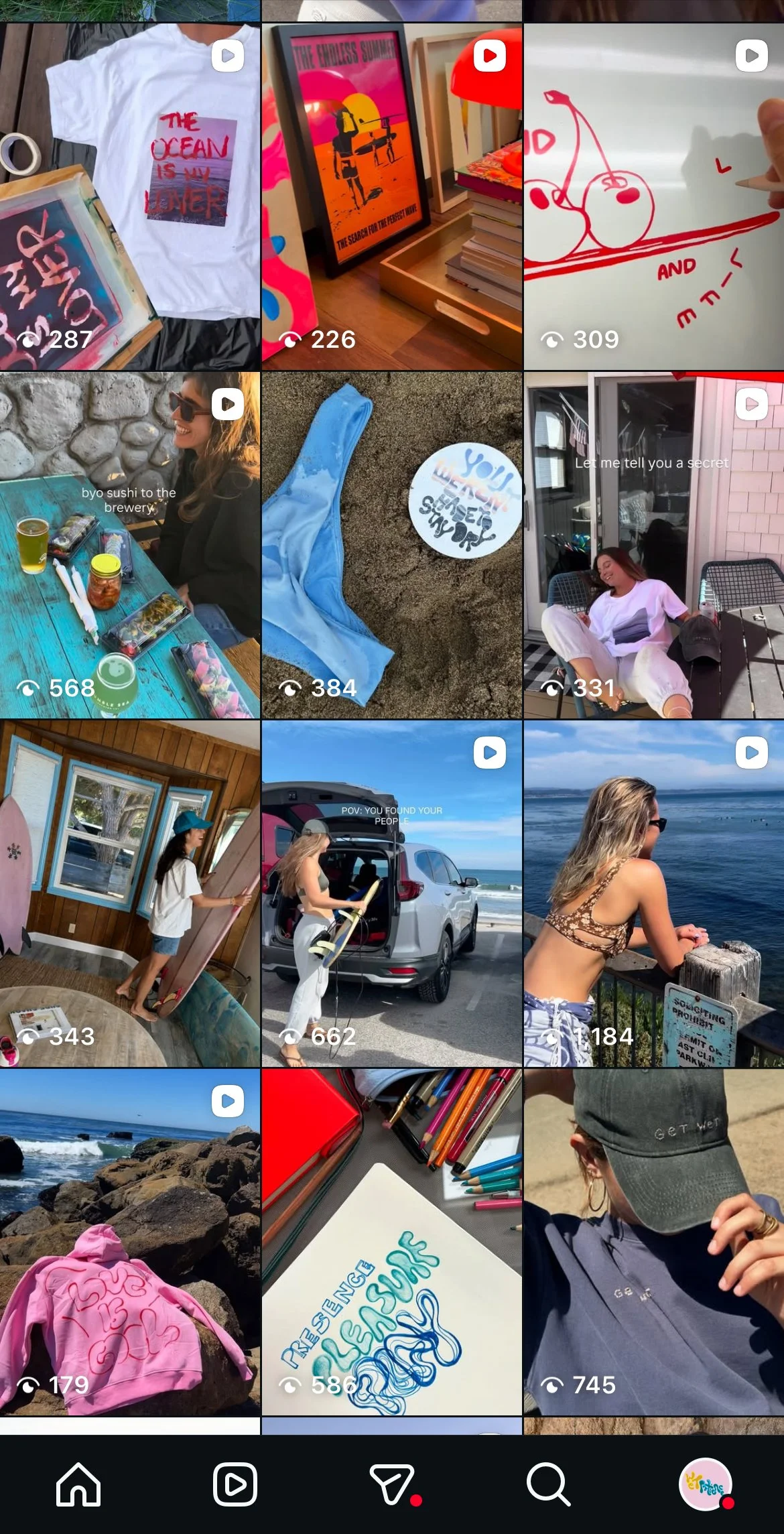
As the project gained traction, I expanded Wet Patience beyond prototypes into a small-scale brand experiment. I designed core pieces, built a website and social, and launched several releases— testing how the language, visuals, and products functioned together in the real world.
Brand Launch

Two contrasting sweatshirts. One expresses an edgy, cool, and independent energy; the other embodies joy, play, and warmth. Color, materials, construction methods, imagery, and messaging were all intentional to capture the intended energy / feeling.